Ling's Grub
A New Coat of Paint
A case study of a rebranding project for a Strategic Design for Business course.
Based on a real restaurant that used to be located in Main Street, Vancouver, for 15 years. Originally named "Grub".
The restaurant has since closed down in October 2024.
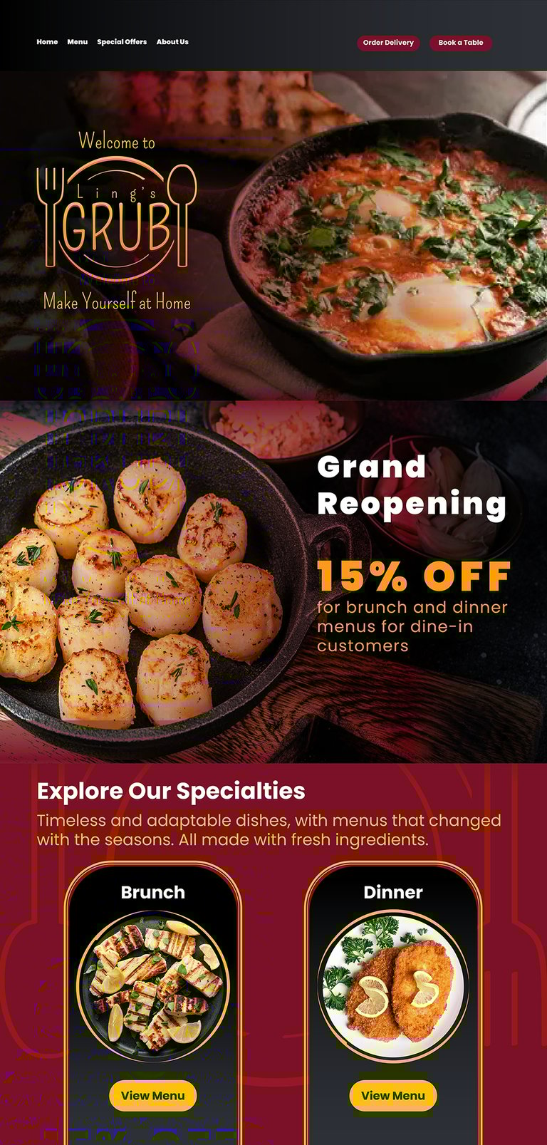
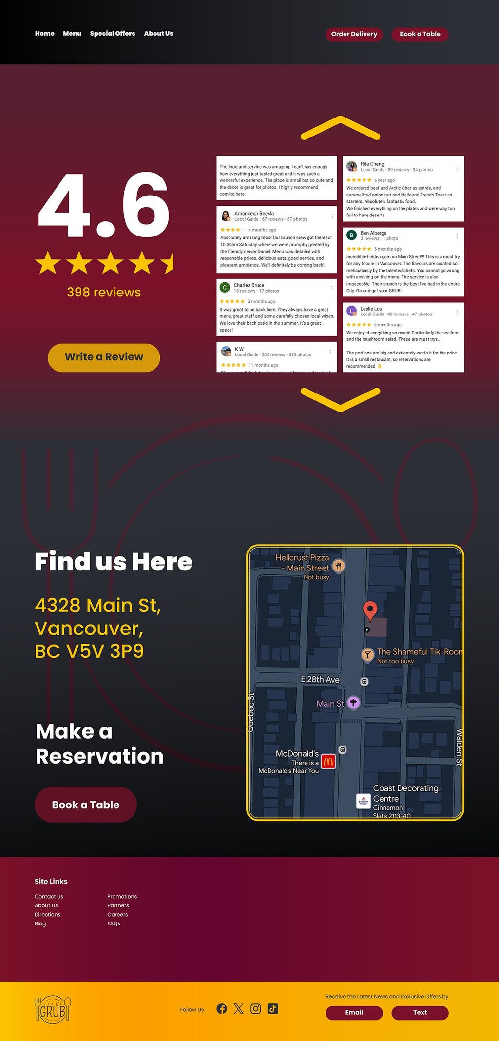
The project includes: Designs for the logo, business card, envelope, letterhead, menu, packaging, ad campaigns, and a new landing page for their website.
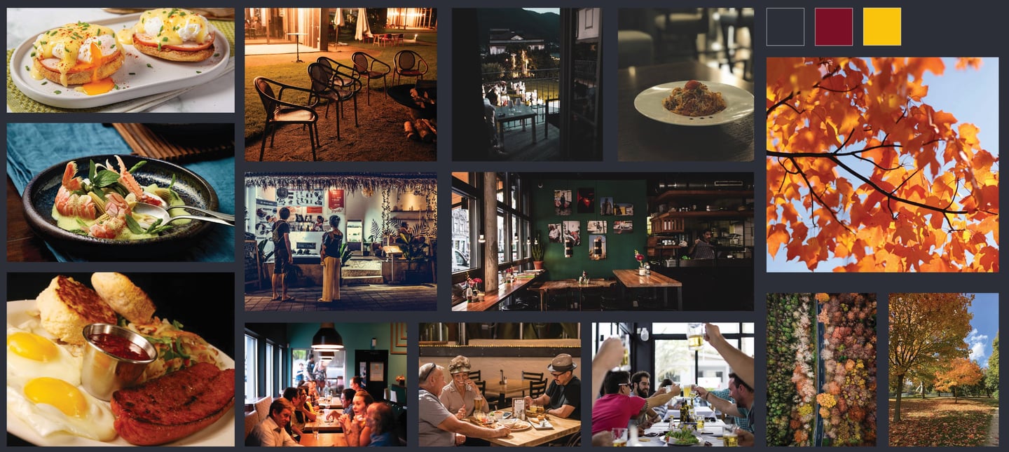
Mood Board
Brand Colours
Wine Red
Obsidian Hue
Golden Honey
#7B1126
#2D3037
#FCC300
C: 0%, M: 86.18%, Y: 69.11%, K: 51.76%
R: 123, G: 17, B: 38
C: 18.18%, M: 12.73%, Y: 0%, K: 78.43%
R: 45, G: 48, B: 55
C: 0%, M: 22.62%, Y: 100%, K: 1.18%
R: 252, G: 195, B: 0
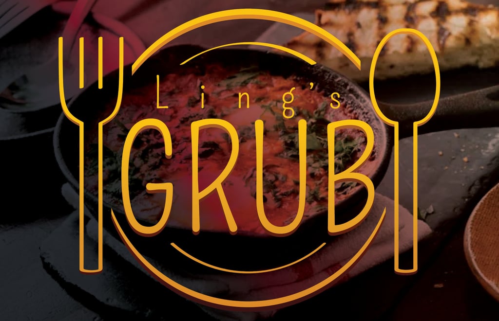
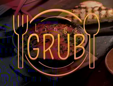
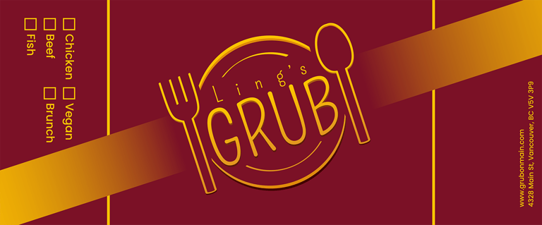
Logo Design
Simple and symmetrical.
Emphasis of creating a
welcoming atmosphere.Utilizes restaurant iconography; the plate and eating utensils are a big part of the design.
A large and eye-catching design to be visible from afar.
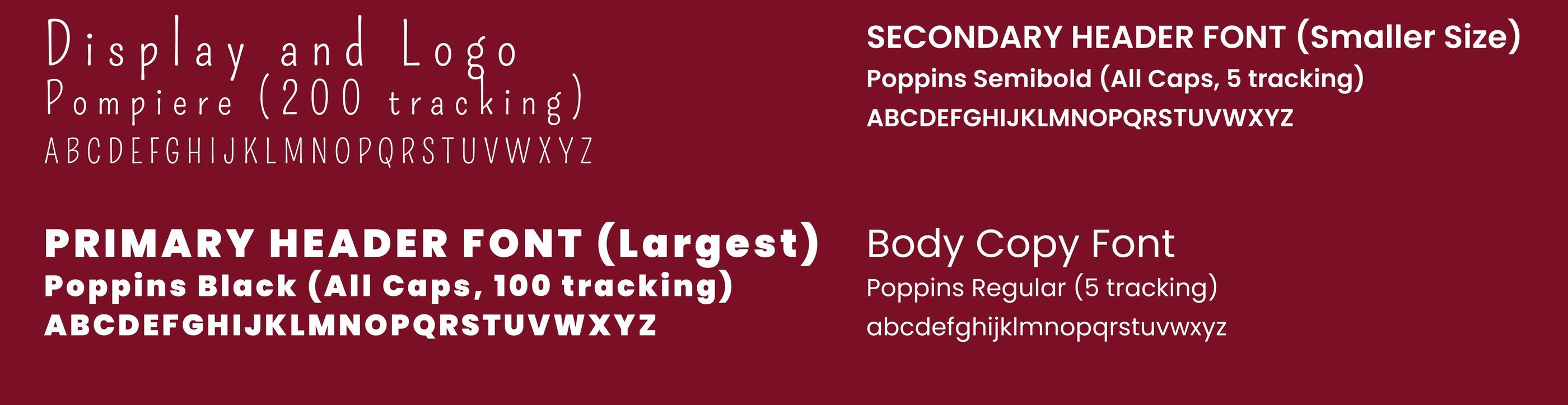
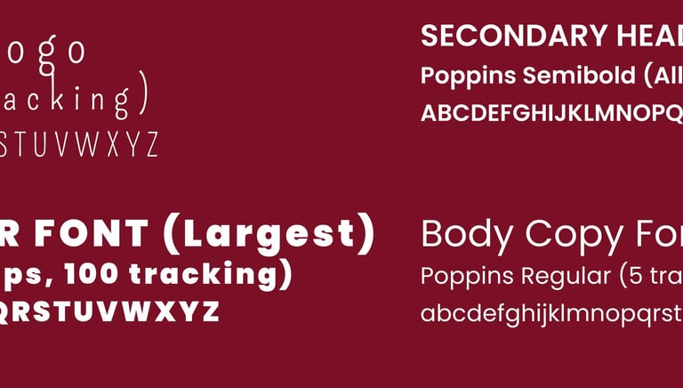
Typography

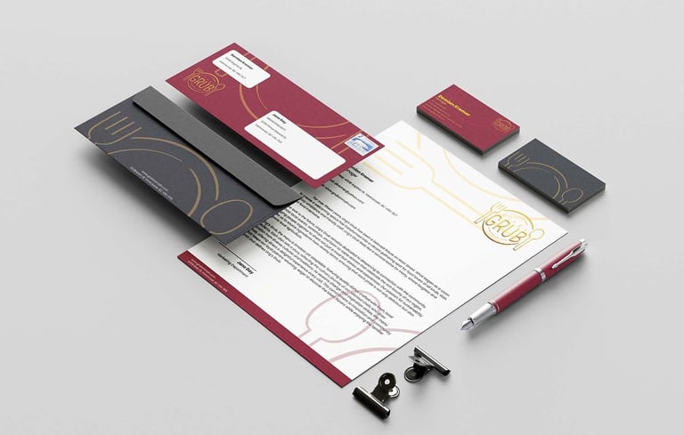
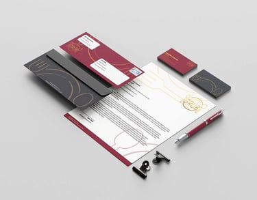
Stationary Packaging
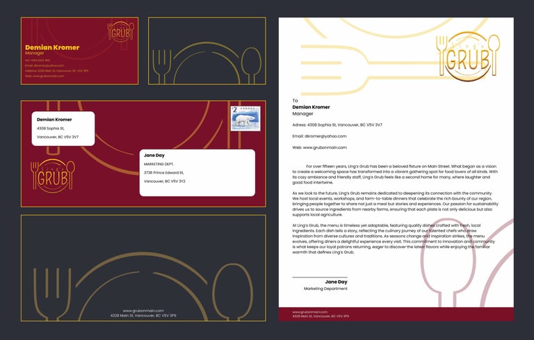
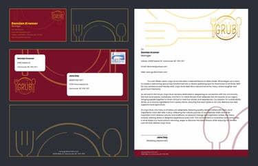
Business card, envelope, and letterhead
Custom Designs
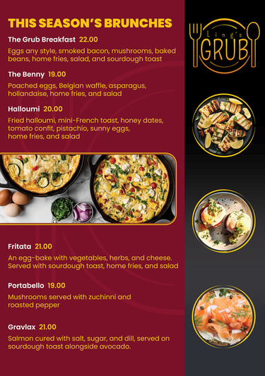
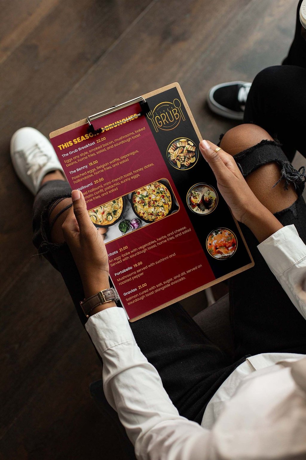
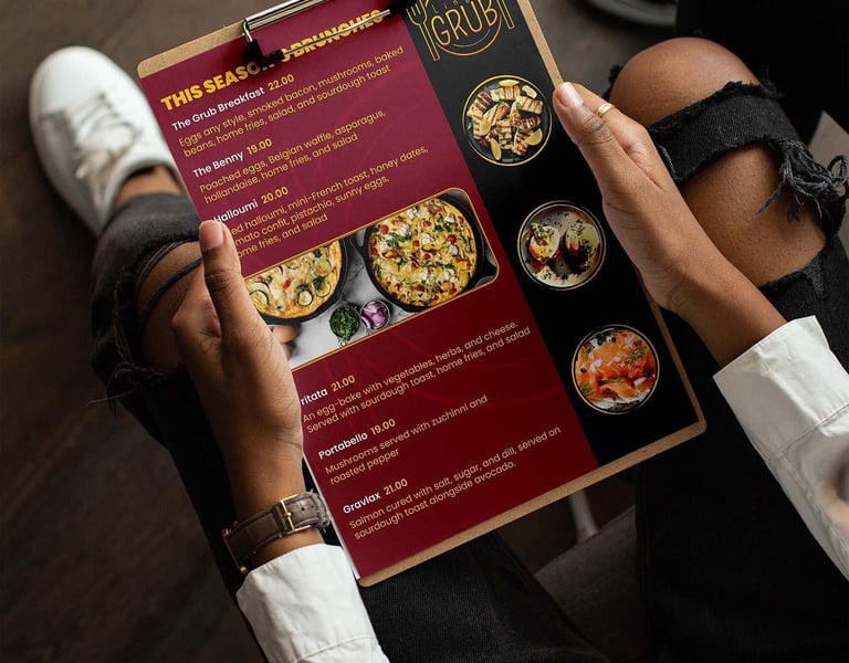
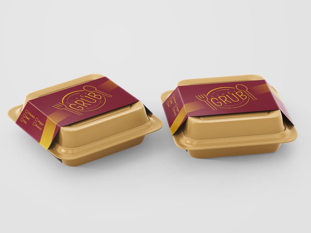
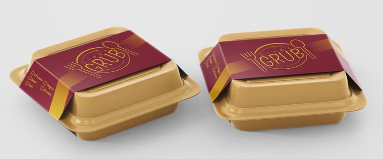
Menu and Packaging

Ad Campaigns
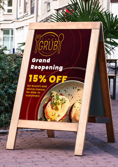
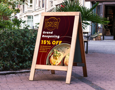
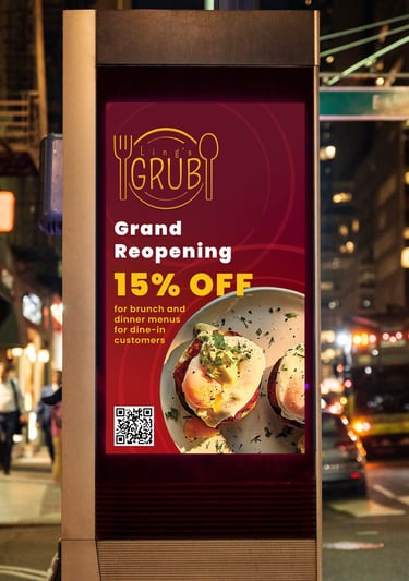
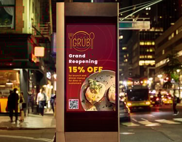
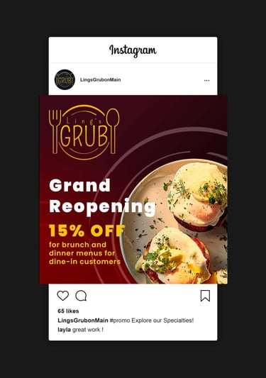
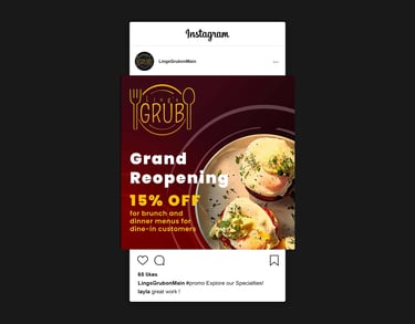
Signage, Digital Screen, and Social Media Design